fiftynine.io


Digging Deeper Into Plotting Performance Using R
R and r
In this post I talked about the first steps I’d taken to generate charts in R using the performance monitor data collected from a SQL Server instance. In this one I’m going to look at steps we can take to refine the process and simplify the view for the user.
A point distant from others
One of the problems I found initially was how to group certain metrics together. As there are 59 counters in the perfmon template I use, and that’s before the individual instances for each one are included, so I could easily have over 100 graphs. Obviously I can’t present this to anyone so I needed to group them together into relatable data groups and ideally I’d like to present no more than 10 charts.
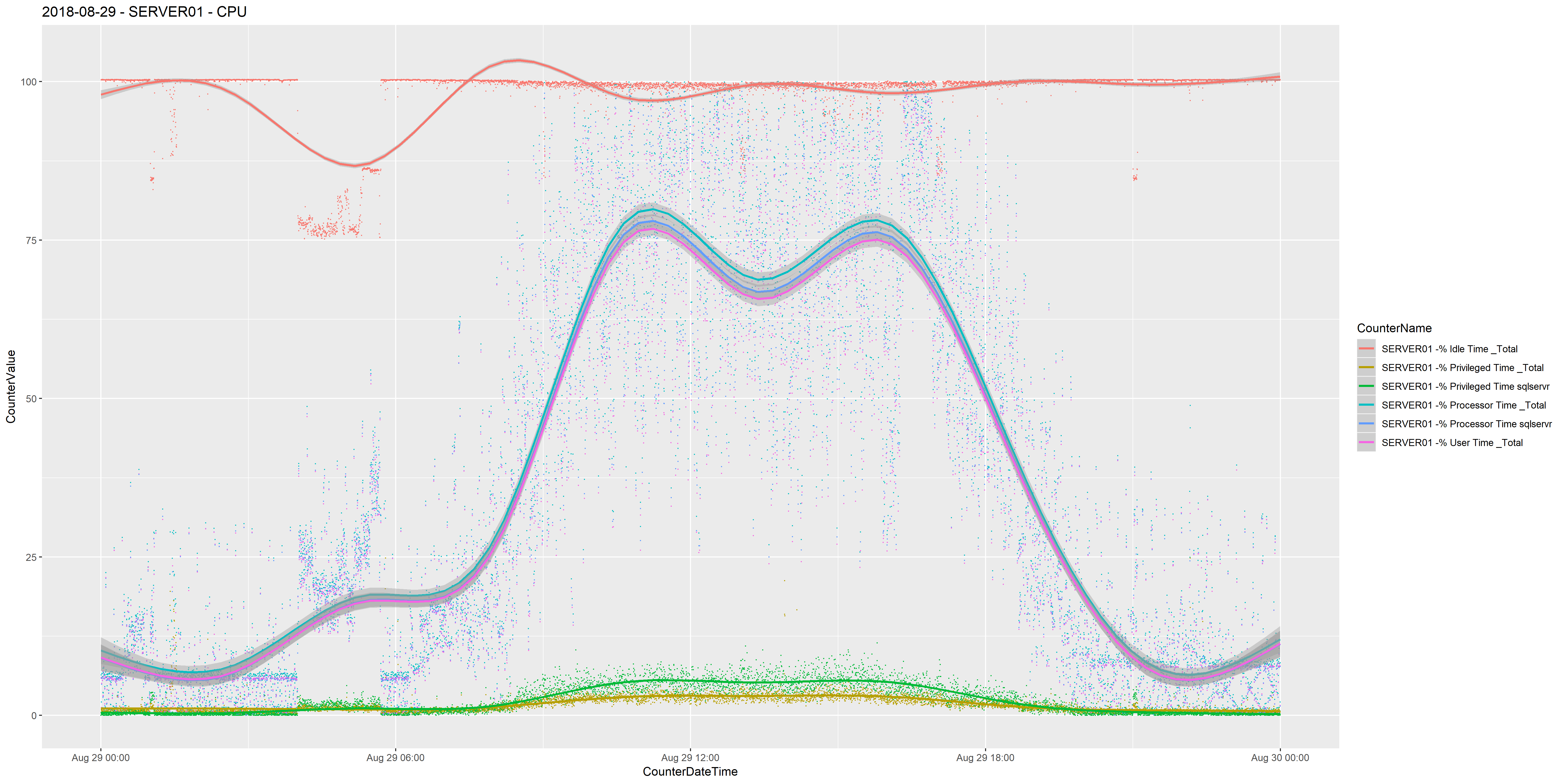
This presents another problem though, as some metrics have much higher data points than others. For CPU related counters it’s no so much of a problem, for example;
'Processor % Privileged Time _Total',
'Processor % Processor Time _Total',
'Processor % User Time _Total',
'Process % Privileged Time sqlservr',
'Process % Processor Time sqlservr',
'PhysicalDisk % Idle Time _Total'
All of the above counters max out at 100 and have a minimum of 0 so it makes it easy to view them all in one chart.
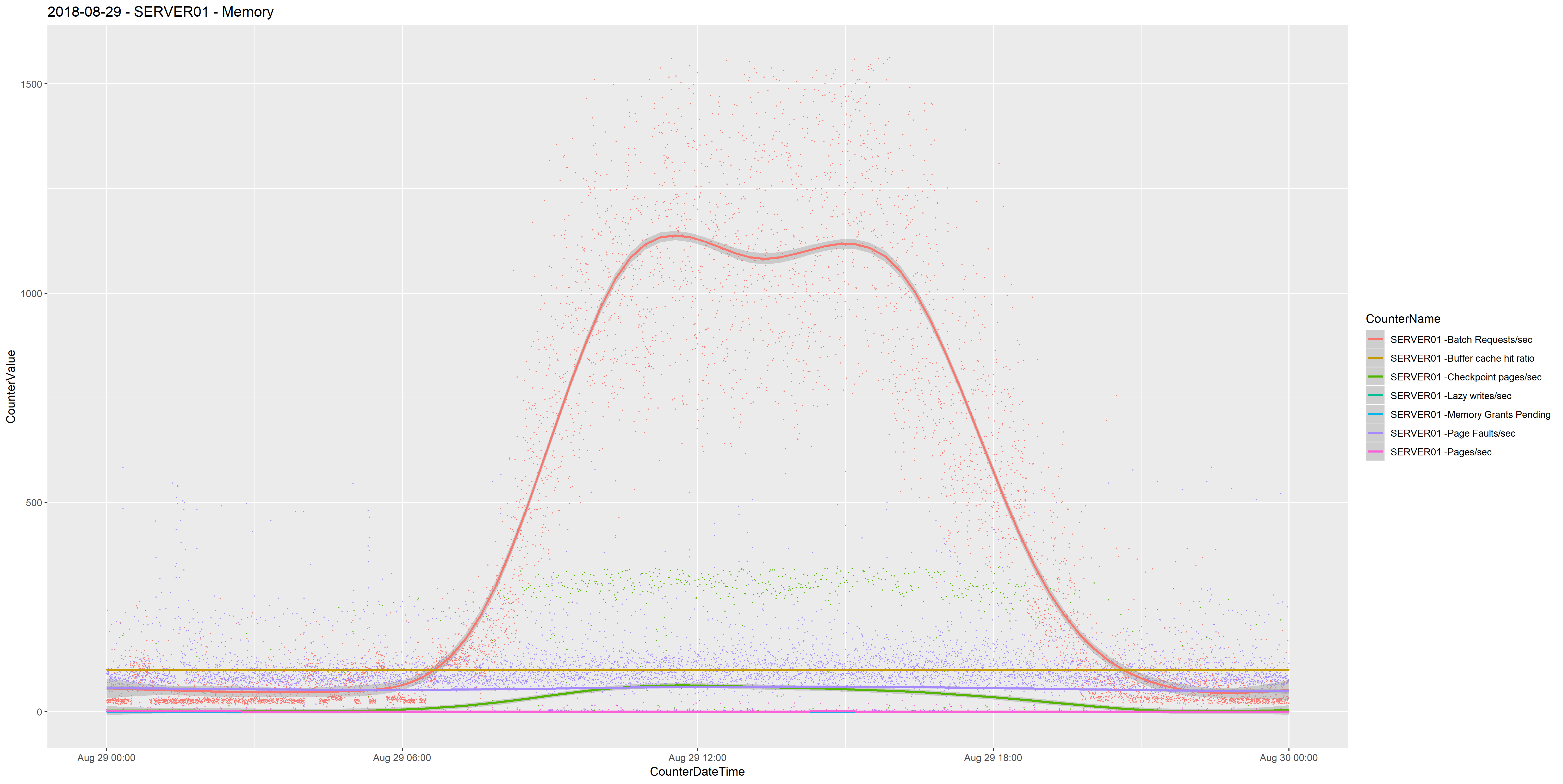
Counters than have no comparable maximum such as Batch Requests/sec make it difficult to view with other counters. It would be nice to see Batch Requests/sec in the same chart as Memory Grants Pending or Buffer Cache Hit Ratio, but we see 0 and 100 for both counters respectively, and these can be hidden when there are spikes of Batch Requests/sec of 3000.
One way of approaching this is to remove outliers from either side of the Batch Requests/sec counter. We can do this in SQL Server using the NTILE function, (from Microsoft) …
Distributes the rows in an ordered partition into a specified number of groups. The groups are numbered, starting at one. For each row, NTILE returns the number of the group to which the row belongs.
I created a view that uses the NTILE() function to group the CounterValue data into 100 buckets partitioned by the CounterName. (I’m using a UNION clause to join two queries because the example I’m using as the source is a SQL Server Cluster). I’m then filtering out the CounterValue data that falls into bucket 1 and bucket 100, therefore removing the outliers.
CREATE VIEW [r].[Memory] AS

SELECT
    CounterDateTime,
    CounterName,
    CounterValue
FROM
(
    SELECT DISTINCT
        CONVERT(datetime, CONVERT(VARCHAR(22), CounterDateTime)) AS CounterDateTime,
        'SERVER01 -'+b.CounterName AS 'CounterName',
        a.CounterValue,
        NTILE(100) OVER (PARTITION BY 'SERVER01 -'+b.CounterName ORDER BY CounterValue) AS Bucket
    FROM CounterData a
        inner join CounterDetails b on a.CounterID=b.CounterID
    WHERE b.MachineName='\\SERVER01'
        and b.ObjectName + ' ' + b.CounterName in
            (
                'Memory Pages/sec',
                'Process Page Faults/sec',
                'SQLServer:Access Methods Page Splits/sec',
                'SQLServer:Buffer Manager Buffer Cache Hit Ratio',
                'SQLServer:Buffer Manager Checkpoint pages/sec',
                'SQLServer:Buffer Manager Lazy Writes/sec',
                'SQLServer:Memory Manager Memory Grants Pending',
                'SQLServer:SQL Statistics Batch Requests/sec'
            )
    UNION
    SELECT DISTINCT
        CONVERT(datetime, CONVERT(VARCHAR(22), CounterDateTime)) AS CounterDateTime,
        'SERVER02 -'+b.CounterName,
        a.CounterValue,
        NTILE(100) OVER (PARTITION BY 'SERVER02 -'+b.CounterName ORDER BY CounterValue) AS Bucket
    FROM CounterData a
        inner join CounterDetails b on a.CounterID=b.CounterID
    WHERE  b.MachineName='\\SERVER02'
        and b.ObjectName + ' ' + b.CounterName in
        (
            'Memory Pages/sec',
            'Process Page Faults/sec',
            'SQLServer:Access Methods Page Splits/sec',
            'SQLServer:Buffer Manager Buffer Cache Hit Ratio',
            'SQLServer:Buffer Manager Checkpoint pages/sec',
            'SQLServer:Buffer Manager Lazy Writes/sec',
            'SQLServer:Memory Manager Memory Grants Pending',
            'SQLServer:SQL Statistics Batch Requests/sec'
        )
) AS mainquery
WHERE Bucket > 1 and Bucket < 100
GO
This allows me to plot a chart that contains Batch Requests/sec that doesn’t bury the other counters.
Ten charts one screen
The second issue I ran into was when I wanted to visualise IO latency. In my example data there is a separate volume for data, transaction logs, tempdb data, tempdb transaction log and backups, and I want to be able to group Avg. Disk sec/Read and Avg. Disk sec/Write together. All of this creates a chart with ten plots and it makes difficult to interpret.
I found the perfect solution in the facet_wrap function. Adding this to the ggplot function, using the ~CounterName parameter
ggplot(data=perfmon, aes(x=CounterDateTime,y=CounterValue,colour=CounterName)) + geom_point(size=.1) + stat_smooth() + facet_wrap(~CounterName) +
This creates multiple charts, per facet, in one graph page so you segregate the same CounterValue on the instance. I needed to explicitly name the instance in the output so I created the following view for IO latency.
CREATE VIEW [r].[IOLatency] AS
SELECT
    CounterDateTime,
    CounterName,
    CounterValue
FROM
(
    SELECT distinct
        a.CounterDateTime,
        'SERVER01 -'+b.CounterName+b.InstanceName AS 'CounterName',
        a.CounterValue,
        NTILE(100) OVER (PARTITION BY 'SERVER01 -'+b.CounterName ORDER BY CounterValue) AS Bucket
    FROM CounterData a
        inner join CounterDetails b on a.CounterID=b.CounterID
    WHERE b.MachineName='\\SERVER01'
        and b.ObjectName + ' ' + b.CounterName in
            (
                'PhysicalDisk Disk Reads/sec',
                'PhysicalDisk Disk Writes/sec'
            )
    UNION
    SELECT distinct
        a.CounterDateTime,
        'SERVER02 -'+b.CounterName+b.InstanceName,
        a.CounterValue,
        NTILE(100) OVER (PARTITION BY 'SERVER02 -'+b.CounterName ORDER BY CounterValue) AS Bucket
    FROM CounterData a
        inner join CounterDetails b on a.CounterID=b.CounterID
    WHERE b.MachineName='\\SERVER02'
        and b.ObjectName + ' ' + b.CounterName in
            (
                'PhysicalDisk Disk Reads/sec',
                'PhysicalDisk Disk Writes/sec'
            )
) AS mainquery
WHERE Bucket > 1 and Bucket < 100
GO
Again, I’m using the NTILE() function to remove outliers and using UNION to capture both servers, and I have added the InstanceName.
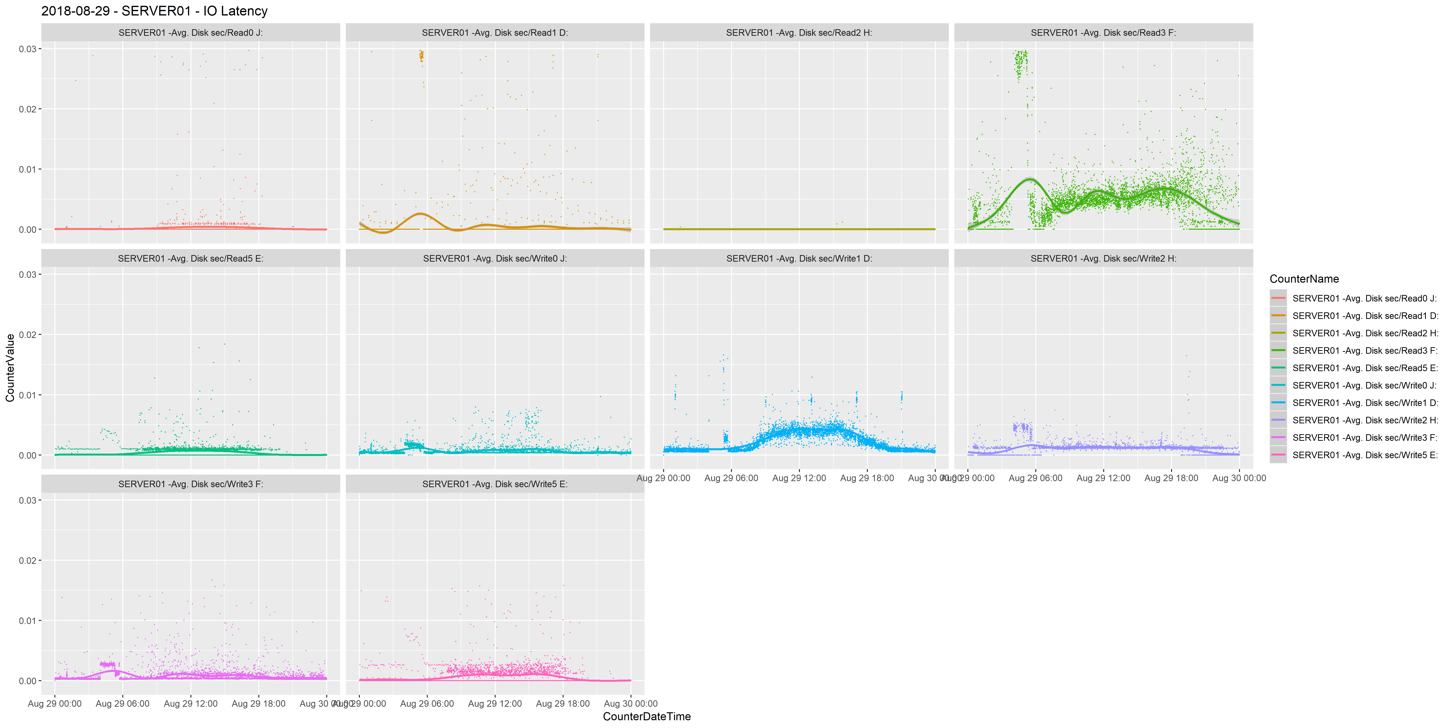
Very cool. Easy to visualise. Easy to identify. Just easy and cool and looks great.
No more input
The final improvement to process is to reduce the time it takes to pull off all the graphs. I was having to run each query and save it once the graph was plotted. For one or two charts this is fine, but I was wanting to compare multiple days across more than one week so I was generating 40-50 charts. I discovered that you can add a line of code to save the file to disk before moving onto the next chart.
ggsave("2018-08-29 - SERVER02 - Memory.png", width = 50.8, height = 25.5, units = "cm")
This sets the filename and lets you set the size, I want to be able present it in detail so I chose a large file, but this can be changed easily.
The end process allows me to run a script in the R console and it’ll work away and produce and save charts without any intervention.
I’m still exploring what I can with this and how far I can take it and I’ll continue to detail my journey. Thanks for reading.